PTE-A.com
세상을 바꾸는 작은 힘
 DI에서 이런 이미지는 어떻게 설명하시나요?
호주가야지
4
5,355
2017.12.07 20:23

저의 DI Template은 이렇습니다.
This given image represents the information the subject.
I can clearly see it from this given image. there ... different sections which are including ... and ...
The most significant feature of this image is that the highest figure is ... with about ... , which was followed by 2nd value. on the other hand, the smallest value is ... 이런식인데요 이게 보통 라인이나 바그래프는 적용이 잘 되는데 이런 이미지에서는 어떻게 적용해야 할지 모르겠네요 노하우 공유 부탁 드립니다.
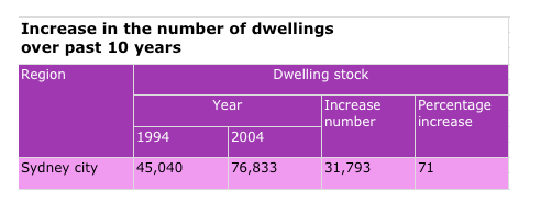
This given TABLE represents the information OF INCREASE IN THE NUMBER OF DWELLINGS OVER PAST 10 YEARS IN SYDNEY.
I can clearly see it from this given TABLE. there ARE TWO different sections which are including YEAR 1994 and YEAR 2004
The most significant feature of this image is that the highest figure is YEAR 2004 with about 77,000, which was followed by 2nd value. on the other hand, the smallest value is YEAR 1994 WITH 45,000.
근데 템플렛 자체에 IN CONCLUSION,......THERE ARE SIGNIFICANT CHANGES WITHIN 10 YEARS AND THIS INFORMATION WILL BE USEFUL FOR REAL ESTATE AGENT OR POTENTIAL FIRST HOME BUYERS. 정도 추가해 주면 좋을거 같아요.
템플렛 자체가 잘 정리된 느낌이 없습니다. 지금이라도 자료실에서 결론까지 잘 되어있는 템플렛 찾으셔서 준비하시는게 좋을거 같습니다.